When Joe and I bought our home 6 years ago, we doubled our square footage from our previous house. Joe got a huge art studio, I got a new office and a separate studio for my creative work, and we got an "official" family room. This meant that we could put our television in a separate room from where we entertain, which is really important to me.
The downside to our family room was that it was UGLY. The previous owners seemed to take every cheap shortcut possible when it came to the basement. And, unfortunately, despite it's ugliness, the basement is where we spend most of our downtime-- unwinding, watching movies, and chilling out after a long day.
Because the room was pretty unsightly, all of our equally ugly furniture ended up down there. It makes sense, right? And, because the entire room was an embarrassment, it became officially known as our Den Of Shame.
You know what I am talking about, right? It's the room you avoid showing in the house tour because it's too much of an eye sore to share with your your friends, (and you're secretly wondering if they would judge you after seeing it.) It's the room where you put the Ikea couch you bought when you were in your early 20s that now has at least 17 different wine stains covering the surface. And it's the room that doesn't get vacuumed all that often because it's just so hard to drag the vacuum cleaner down all. those. steps.
So, on to the before and after photos, which are the best part!
DISCLAIMER: Since my very talented and amazing husband, Joe, has done ALL of the work in this remodel, he would like me to tell you that there are still some finishing details that need to be completed: specifically, the transitions on the floor and the casing for canned lights. Also, you'll probably notice in the "after" pics, that our brand new floor has some footprints on it. That's because our house is super dusty right now, due to the remodel. In fact, as I write this, Joe is finishing up the floor in his studio and completing the staircase. The dust will be hanging around for awhile. :)
BEFORE:
Note the popcorn ceilings, the stained rug, and the ridiculous wall lights that created burn marks on the ceiling.
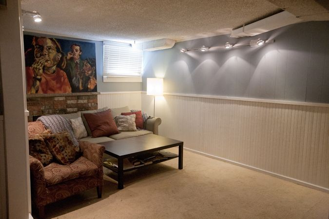
Yes, that is a fireplace back behind the couch. But it was totally dated and it didn't ventilate well. So, we put our couch in front of it. :)
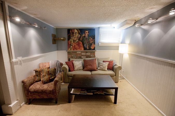
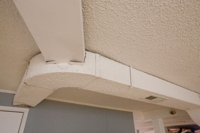
Don't you LOVE the exposed ducts that are covered with popcorn??????
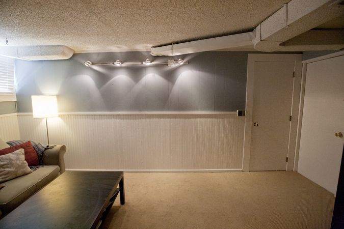
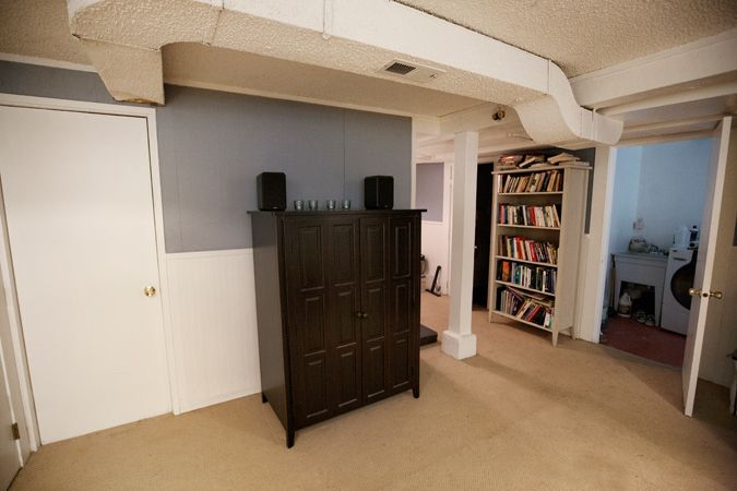
Seriously. Get a close look at just how horrible they are!!! I mean, WHO DOES THAT?!??!!!
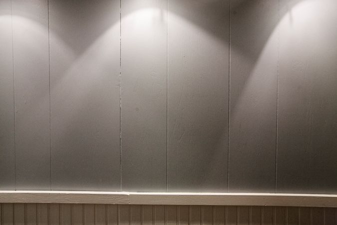
And here is the cheap-ass paneling that was used on the walls. Paper thin and totally useless.
Are you ready for the after pics??????
AFTER:
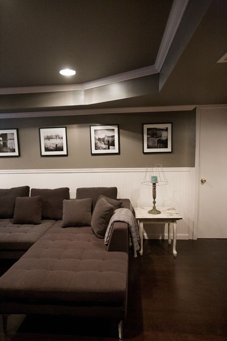
Note how Joe enclosed every bit of ducting. Beautiful, right?
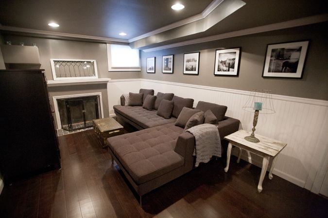
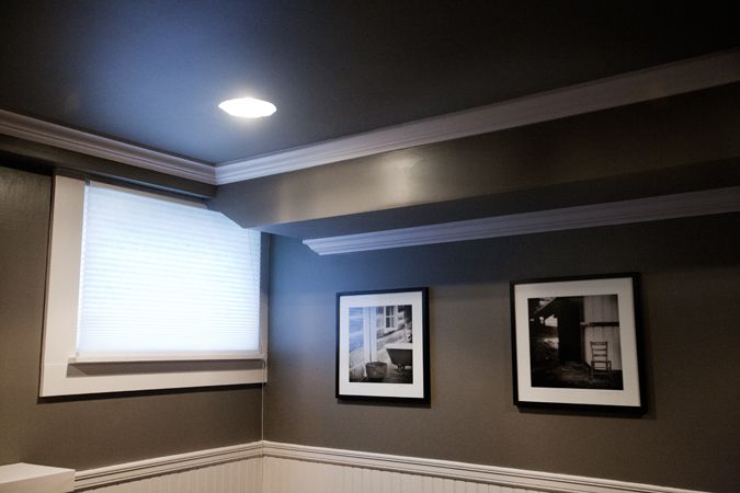
Popcorn ceilings, exposed ducts, cheap paneling, ugly paint, revolting carpet, and crappy lighting-- ALL GONE!!!!!!
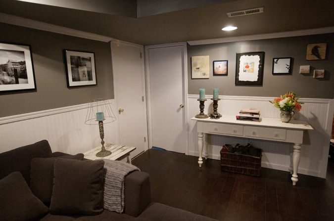
The basement is now full of art! On this wall, from left to right, the artists featured are: Auburn Lahoski, Susannah Conway, Junko Yamamoto, Susannah Conway, Cody Blomberg (the crow), and Ashley DeLatour (the two little square pieces.)
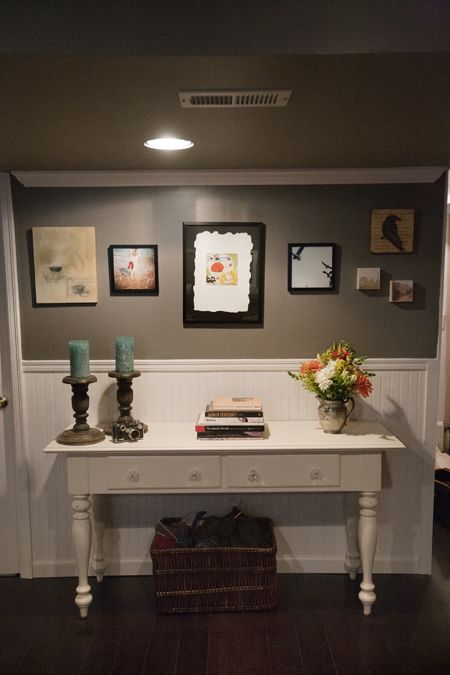
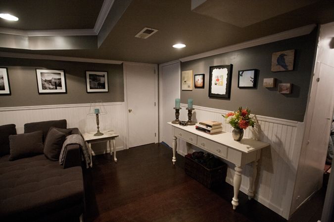
Look at those beautiful soffits...
Remember the ugly (and hidden) fireplace? Ta da!! Joe built an entirely new facade with beautiful molding.
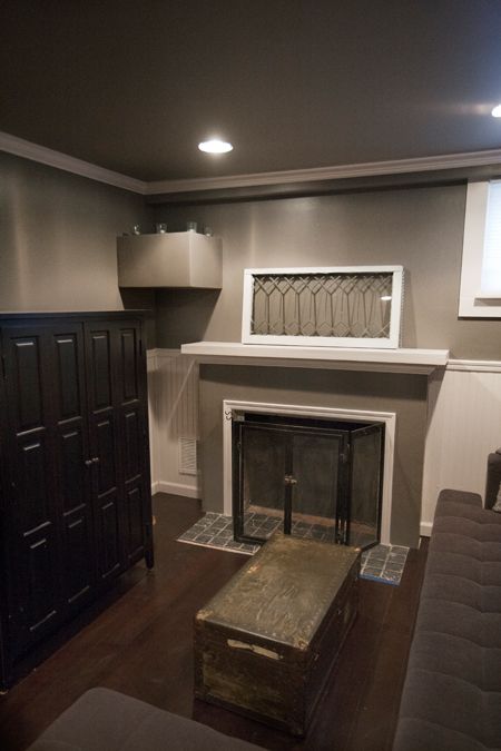
Note our new canned lights now, instead of the ugly wall mounted thing from before...
And, that's it! What do you think? :)

26 comments:
Joe did a beautiful job!!
It looks AMAZING!! Great job! Does Joe want to come remodel our apartment next? :)
I think it's amazing, but then, Joe always does fantastic work! Very happy for you both, now enjoy your new space!!
Sooooo amazing! Gorgeous, love the colors. You guys have such a good eye.
Stunning! Love the color palate, clean lines, and the ceiling. So beautiful. Bravo!
love it!
Holy WOW! What a difference and just gorgeous! Joe is a master and clearly multitalented...definitely a keeper, Clare ;)
AMAZING transformation! I would never leave that room!
Wow, can I hire Joe? ;)
Gorgeous and the sign of much hard work!
Susan
Looks amazing!!! Wow!
Gorgeous transformation! I laughed heartily at your opening comments, Clare. I'm sitting in my bedroom which is MY den of shame. All the stuff not yet sorted and put away since my move in January. The rest of the house is beautiful, but no one sees my bedroom...hopefully.
You both are so impeccable and creative in design, and the room is beautiful and so comfortable looking. Your couch looks so much like mine. Joe's skills are amazing! You both are perfectionists. And Joe is way beyond "handyman". ENJOY it all!
very beautiful! nice job joe!
Joe, you are totally and utterly AMAZING. What an artist. And that's an understatement! Love the new downstairs... way to go!
OOOOH, it's like MTV Cribs! xx
Absolutely BEAUTIFUL!!!!
Joe is a keeper x 1000! It's just beautiful, Clare! You must be so happy to be in this wonderful space! :)
Wow! It is amazing! What a transformation!
Clare - it's gorgeous!! What an amazing job your hubby did with the remodel and you did with the decorating!!
Dang guys!!! That's crazy awesome!!! What a difference!
Looks amazing! You should totally submit it to "before & after" on Design Sponge!!!
Wow, I know I'm late to this party but dang.... you should definitely keep that man! Beautiful transformation.
Amy
Where did you get the couch I love it
The couch was purchased at the Kasala outlet in the SoDo neighborhood of Seattle. Great deals and customer service there!!
Any idea what the paint color is ?? I love it!!
Jessica, according to my husband, the brand is Behr Plus, and the color is Delorian Gray.
Post a Comment